Landing pages are essential for lead generation, yet most businesses don’t use them enough or even at all. It’s common that most companies give more attention to their website’s home page since it’s the first page users see when they “walk in the door.” However, a good portion of your users will search on Google or Bing and land on a page more specific to their search term, that is not your home page.
A landing page is crucial for any website because it provides a much more targeted platform that converts visitors into leads. In fact, landing pages have a 5-15% conversion rate, which is 5x more than the average website!
So how do you create the perfect landing page, made for targeting and converting your visitors? Let’s walk you through five different landing page tips that’ll make for higher conversion rates:
1. Elements to Include on your Landing Page:
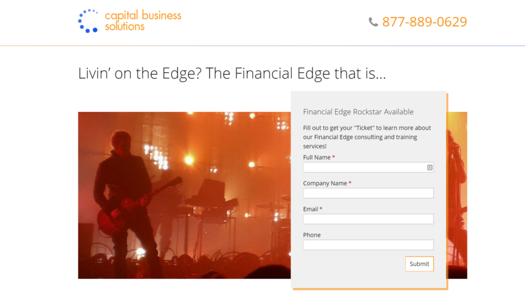
- Headline and (optional) sub-headline
- Concise description of what is being offered
- Supporting image or video
- (Optional) social proof e.g. testimonials, customer logos, etc.
- Form to capture information or a strong CTA button if a form is not applicable
2. Remove or Limit Navigation
A landing page is supposed to encourage visitors to take one specific action. Leaving the navigation on a landing page may cause them to wander around your website before taking the action the landing page was intended for in the first place. Remove the main site navigation from your landing page so users don’t move off of it.
3. Keep your Objective Clear
Make it clear what your landing page is about and what action you want your visitors to take. Simplicity is also key so limit the amount of text, images, and links as much as possible. You want your call-to-action to really stand out and pop.
4. Focus on Value
Do not create a landing page to download a fact or sizing sheet. DO create a landing page for a valuable white paper, free trial, or evaluation. Offering something of value to your visitors will help you generate more quality leads that you can nurture over time until they are ready to buy.
5. Limit the Form Fields
When it comes to form fields there is really no magic answer to how many you should or should not have. However, the rule of thumb is only ask for what your sales team REALLY needs. Too many form fields will prevent visitors from filling out the form, so stick to the essential information. In addition, never use “Submit” as the form CTA button, instead use “Download Now” or “Join the Club.”
*Bonus* Create lots of landing pages and make your pages shareable. The more landing pages you have the more opportunities you gain for converting more traffic into leads.
Contact Houston Design Agency
It’s time for you to evaluate your existing landing pages and use these best practices as a guide for setting up the perfect page. Effective landing pages are what will transform your website into a lead generation machine!
For more tips on how to optimize your website for more conversions, fill out our contact form here or give us a call at 281-764-9070 to speak with one of our marketing experts!


