If you have been a purveyor of a website within the last ten years, chances are, at some point, it contained a slider. The good news? You’re not alone. The bad news? You’re outdated. Yes, it’s true, the days of a thematically redundant and oft overlooked rotating image carousel are kaput.
Many industry aficionados are calling it quits when it comes to sliders–many have gone so far as to trash the once dominant web design tactic.

“Almost all the testing I’ve managed has proven content delivered via carousels to be missed by users. We’ve witnessed the banner blindness concept in full effect.”
– Adam Fellows
“It gets ignored. It’s distracting. It’s confusing. It squeezes out relevant content. It slows down your site. It causes global warming.”
– James-Royal Lawson
“Rotating banners are absolutely evil and should be removed immediately.”
– Tim Ash
But where do we go from here? Web design is an ever-changing, always evolving syndicate of ideas and technological development. Our industry is, by design, adept to innovation and modification. In order to grow from what started as a great idea–a way for viewers to sift through relevant images at a desirable pace–and turned into a disaster–in which viewers completely ignored what was set out to help them–we must develop on the good parts and throw away the bad.
The best way to make the most of a visual header is via subtlety and creativity. You want your header to stand out so that your viewer pays attention to it–but you don’t want it to distract from the overall purpose of your page.
Some modern header trends that allow for this involve tweaking the notion of a slider so that there is still a little action in the header image, but not so that it detracts from the quality of the site or brand.
Video
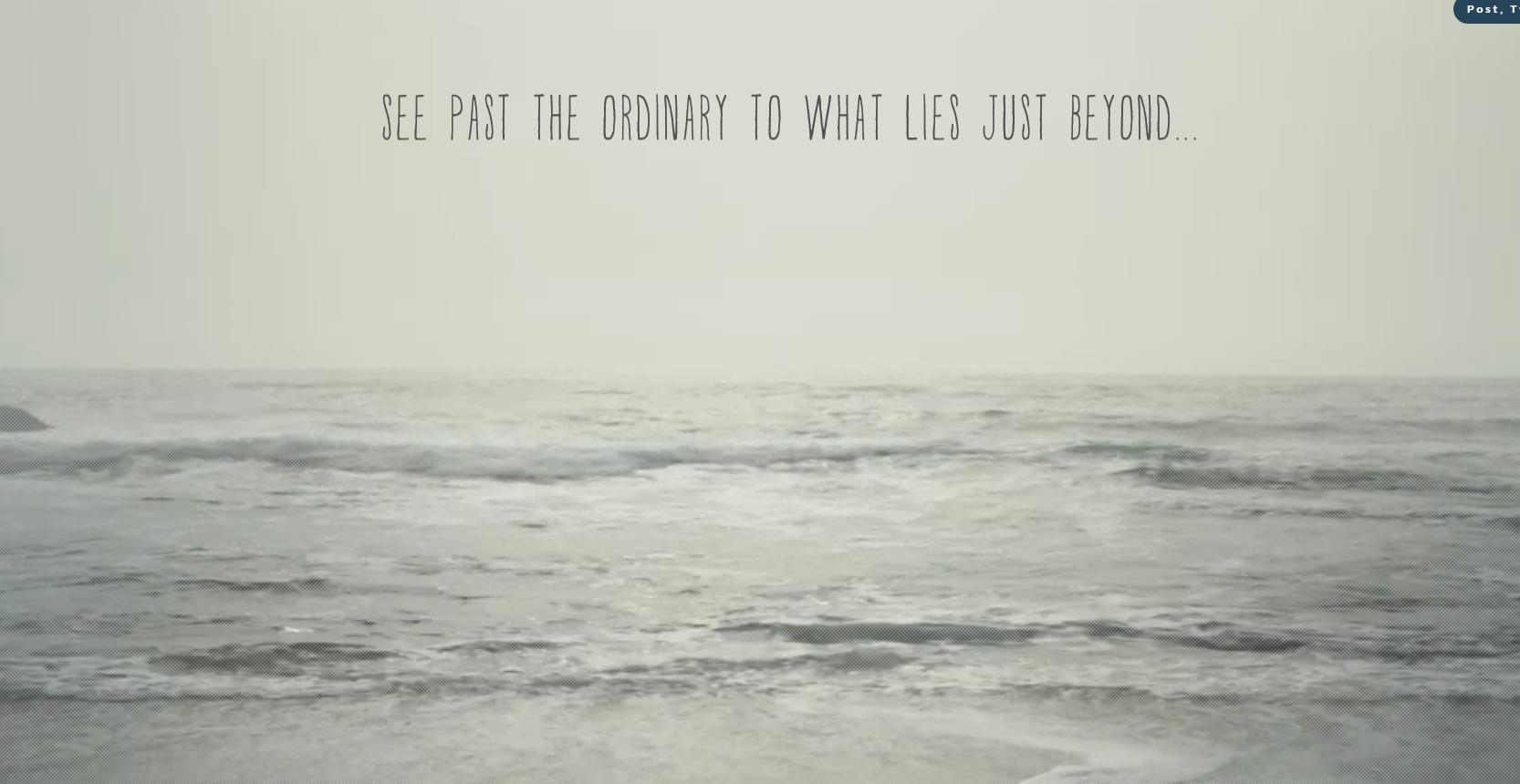
One of the best ways to utilize header or background space and to keep viewers on your website is by using a video to correspond to the message you are trying to portray or to reflect a campaign.
Some great examples of video usage are included below:


Cinemagraphs
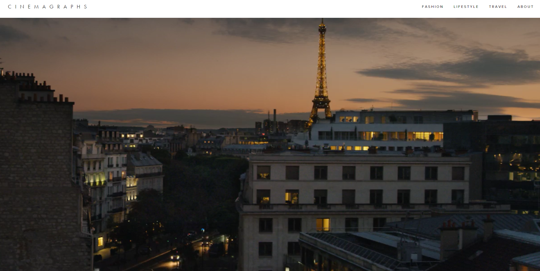
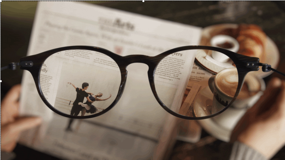
Cinemagraphs are special. Essentially an animated image, Cinemagraphs rely on subtlety and eccentricity to send a clear and tasteful message. They are a remarkably attractive trend in web design, and in order to truly grasp the magnitude at which Cinemagraphs can capture one’s attention, you’ve really got to see for yourself. We’ve included stills of some truly amazing examples, but the entire website is worth a peruse:


Many Other Alternatives
It’s important to remember to be creative. Bottom line: if you want to keep people on your site, you’ve got to attract their attention. Sliders have become far too common and mundane to continue doing this, so companies and organizations must think outside the slider box in order to maintain people’s attention.
Are you in need of Houston Web Design consultation?
Our web design experts are equipped to get your website on trend, and to increase your site traffic and conversions. Give our gurus a call today at 1-800-440-6190 or fill out our contact form.


